The UI has a difficult job. It has to feel like it belongs to a strategy game, but it cannot get in the way of the map. It has to show a lot of information, but it cannot become visual noise. It has to work for menus, HUD panels, modals, the map editor, multiplayer screens, and developer tools, but it cannot turn every screen into a hand-crafted exception.
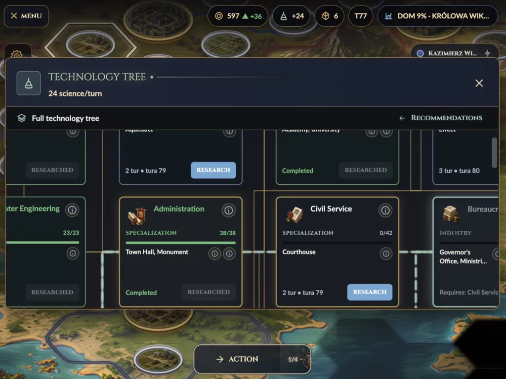
That is why I started treating the Flutter UI as a small design system instead of a collection of widgets.
Not a huge design system. Not a separate package. Not something abstract enough to become its own product.
Just a practical set of rules:
- colors come from one place,
- typography has a small number of roles,
- surfaces have semantic elevation,
- buttons and panels are reusable,
- screens are assembled from templates,
- game-specific UI stays visually consistent with the rest of the app.
Flutter makes it very easy to build one screen quickly. The harder part is making the tenth screen still look like it belongs to the same game.
Flutter as the Interface Layer
The game world itself is rendered with Flame, but most of the interface is Flutter.
That includes:
- main menu,
- game HUD,
- selection panels,
- action buttons,
- resource strips,
- modals,
- options panels,
- map editor controls,
- load/save screens,
- multiplayer lobby screens.
The split is intentional.
Flame renders the board. Flutter renders the interface around it.
flowchart TB
    Game["Game State"]
    ViewModels["Presentation View Models"]
    Flutter["Flutter UI"]
    Flame["Flame Renderer"]

    Game --> ViewModels
    ViewModels --> Flutter
    ViewModels --> Flame

    Flutter --> Commands["Game Commands"]
    Flame --> Commands
The Flutter UI does not own the rules of the game. It shows state, collects intent, and dispatches commands.
That distinction matters even for visual design. If the UI is just a thin layer over the game state, it can stay focused on clarity: what is selected, what can be done, what changed, what needs attention.
The UI Folder Shape
The shared UI code lives around two main areas:
lib/shared/
├── theme/
│   ├── hud_palette.dart
│   ├── game_ui_theme.dart
│   ├── surface_elevation.dart
│   ├── surface_shape.dart
│   ├── border_emphasis.dart
│   └── chip_tone.dart
└── widgets/
    └── game_ui/
        ├── epic_button.dart
        ├── epic_card_surface.dart
        ├── game_modal.dart
        ├── game_modal_scaffold.dart
        ├── game_ui_app_bar.dart
        ├── game_ui_screen_header.dart
        ├── game_ui_epic_header.dart
        └── game_ui_options_panel.dart
This is not the entire presentation layer. The game HUD has its own widgets, the editor has its own controls, and the renderer has its own visual components.
But this shared layer defines the language.
It answers questions like:
- What does a panel look like?
- What color is an accent?
- How strong should a border be?
- What does a primary button feel like?
- How does a modal header work?
- What typography should a compact HUD label use?
Without this layer, every screen would slowly invent its own answers.
The Palette: One Place for Color
The palette starts with HudPalette.
abstract final class HudPalette {
  static const Color bg = Color(0xFF0A0A0E);
  static const Color surface = Color(0xFF101620);
  static const Color surfaceDeep = Color(0xFF1A2030);
  static const Color card = Color(0xFF131B26);

  static const Color gold = Color(0xFFD2A856);
  static const Color goldLight = Color(0xFFF0DCAE);
  static const Color goldDark = Color(0xFF8C6926);

  static const Color copper = Color(0xFFB47A4E);
  static const Color copperDeep = Color(0xFF7A4A28);

  static const Color success = Color(0xFF6CC07A);
  static const Color warning = Color(0xFFF0C36A);
  static const Color danger = Color(0xFFC0392B);
  static const Color info = Color(0xFF6FA8D6);

  static const Color textPrimary = Color(0xFFF0EDE6);
  static const Color textSecondary = Color(0xFFA0A5B2);
  static const Color textTertiary = Color(0xFF747787);
}
The visual direction is a dark strategy-game interface with warm metallic accents. The background is almost black, but not pure black. The surfaces are dark navy. Gold carries the fantasy/empire tone. Copper gives hover and glow states a warmer secondary accent.
The important part is not just the colors themselves. It is the rule that colors should be named by role.
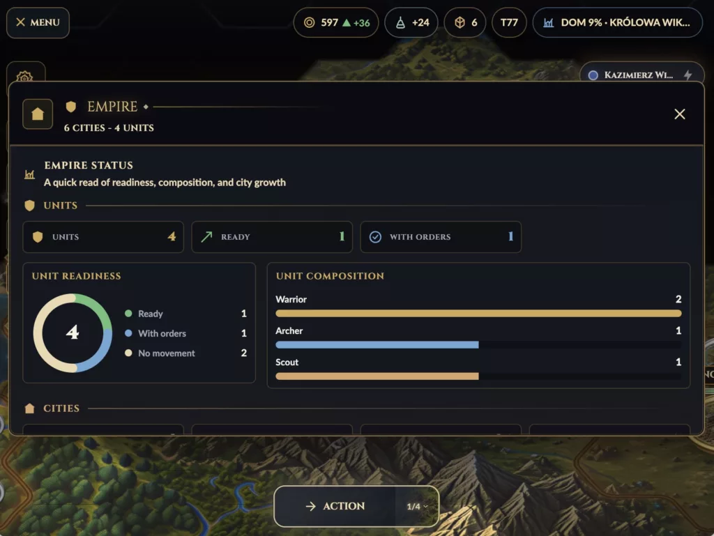
A random widget should not decide that its border is Color(0xFFD2A856). It should say GameUiTheme.gold, GameUiTheme.border, ChipTone.warning, or SurfaceElevation.raised.
That makes the UI easier to change later. If the gold becomes too saturated, I want to change the palette, not hunt through the whole app.
GameUiTheme: Re-exporting the Visual Language
GameUiTheme sits above the palette.
It re-exports colors and adds typography, radii, gradients, and button styles.
abstract final class GameUiTheme {
  static const String headingFont = 'Cinzel';
  static const String bodyFont = 'Lato';

  static const Color bg = HudPalette.bg;
  static const Color surface = HudPalette.surface;
  static const Color gold = HudPalette.gold;
  static const Color danger = HudPalette.danger;
  static const Color textPrimary = HudPalette.textPrimary;
  static const Color textSecondary = HudPalette.textSecondary;

  static const double radiusFrame = 2;
  static const double radiusCard = 10;
  static const double radiusPill = 999;
  static const double radiusButton = 12;

  static const TextStyle cardTitle = TextStyle(
    color: goldLight,
    fontFamily: headingFont,
    fontSize: 15,
    fontWeight: FontWeight.w700,
  );
}
I use two fonts with different jobs:
Cinzelfor headers, labels, buttons, and places where the UI should feel more “historical” or ceremonial.Latofor body text, numbers, descriptions, and dense HUD content.
That split helps the interface feel thematic without making everything hard to read. A 4X game has too much information to use decorative typography everywhere.
The UI needs flavor, but the player still has to parse numbers quickly.
Semantic Surfaces Instead of Random Containers
One of the most useful ideas in the UI layer is SurfaceElevation.
Instead of every widget creating its own BoxDecoration, I define a few surface roles:
enum SurfaceElevation {
  flat,
  raised,
  floating,
  modal;
}
Each level has a background alpha, border emphasis, blur radius, shadow strength, and optional glow.
A small inline chip can use flat.
A main HUD panel can use raised.
A popover can use floating.
A modal can use modal.
That gives the interface a hierarchy.
flowchart TB
    Flat["flat. quiet inline surfaces"]
    Raised["raise. main HUD panels"]
    Floating["floating. popovers and pills"]
    Modal["modal. focused dialog surfaces"]

    Flat --> Raised --> Floating --> Modal
The code that uses it stays readable:
DecoratedBox(
  decoration: SurfaceElevation.raised.decoration(
    gradient: GameUiTheme.panelSurfaceGradient(),
    borderColor: GameUiTheme.gold,
    borderAlpha: 170,
    radius: GameUiTheme.radiusCard,
  ),
  child: child,
);
This is not only about aesthetics. It keeps the UI from becoming visually inconsistent.
If every panel invents its own shadow, alpha, border width, and radius, the game starts to look like several prototypes stitched together. Semantic surfaces prevent that.
Border Emphasis and Shape
The same idea applies to borders.
enum BorderEmphasis {
  subtle(60),
  regular(110),
  strong(160),
  active(220);
}
Instead of thinking in raw alpha values, I can think in intent:
subtlefor background structure,regularfor normal UI boundaries,strongfor important surfaces,activefor selection or focus.
Shapes are also named:
enum SurfaceShape {
  frame(2),
  chip(14),
  card(10),
  button(12),
  pill(999);
}
That keeps visual decisions consistent. If something is a chip, it should look like a chip. If something is a frame, it should be sharper and more structural. If something is a pill, it can be fully rounded.
This matters because strategy UI contains many small repeated elements: badges, pills, action buttons, resource counters, selected-state markers, warnings, and metadata labels.
Small inconsistencies add up fast.
Tones for Chips and Badges
For small pieces of information, I use semantic chip tones:
enum ChipTone {
  neutral,
  accent,
  warning,
  danger,
  success;
}
A warning should not be “yellow because I remembered yellow”. It should be ChipTone.warning.
That makes UI code more expressive. A widget does not need to know the exact warning color, border alpha, or background treatment. It only needs to know the meaning.
final spec = ChipTone.warning.spec;This is especially useful in a game HUD, where small labels often carry important meaning:
- unit needs orders,
- city has no production,
- research is missing,
- command cannot be executed,
- player is waiting,
- objective is complete.
The player reads the screen faster when repeated meanings have repeated visual treatment.
Reusable Buttons
The shared button is EpicButton.
It has three variants:
enum EpicButtonVariant {
  primary,
  outlined,
  text,
}
That gives me a simple hierarchy:
primaryfor the main action,outlinedfor normal actions,textfor secondary or cancel actions.
The button handles hover, pressed, disabled, icon, padding, and minimum width.
EpicButton.primary(
  label: 'Start Game',
  icon: Icons.play_arrow_rounded,
  onPressed: startGame,
)
The point is not that every button must be fancy. The point is that buttons should feel like they come from the same world.
A strategy game has many actions. If every button has a slightly different hover state, radius, padding, and font, the interface becomes harder to scan.
Card Surfaces and Modals
EpicCardSurface is the reusable frame for larger panels.
It handles the outer frame, inner border, optional header, close button, gold divider, and small visual details like corner diamonds.
EpicCardSurface(
  header: header,
  content: content,
  onClose: onClose,
)
On top of that, GameModalScaffold gives dialogs a consistent structure:
GameModalScaffold(
  header: GameModalHeader(
    title: 'Save Map',
    icon: Icons.save_outlined,
  ),
  content: SaveMapForm(...),
  actions: [
    GameModalAction(
      label: 'Cancel',
      variant: EpicButtonVariant.text,
      onPressed: close,
    ),
    GameModalAction(
      label: 'Save',
      variant: EpicButtonVariant.primary,
      onPressed: save,
    ),
  ],
)
This is what I mean by templating in this project.
Flutter does not need a template engine here. The “templates” are composable widgets that encode layout and visual rules.
A modal should not be rebuilt from scratch every time. A screen header should not be redesigned on each screen. An empty state should not have five different versions.
Reusable templates make new UI faster, but more importantly, they make it harder to accidentally break the visual language.
Screen Templates
For normal screens, I use shared structures like:
GameUiAppBar,GameUiScreenHeader,GameUiMetaPill,GameUiEmptyState,GameUiOptionsPanel.
A screen can still have its own content, but its frame is familiar.
GameUiScreenHeader(
  icon: Icons.map_outlined,
  title: 'Map Editor',
  subtitle: 'Create and tune playable worlds.',
  meta: [
    GameUiMetaPill(
      icon: Icons.grid_on_rounded,
      label: 'Hex Map',
    ),
  ],
)
This helps with screens like the map picker, editor, options, loading states, and setup flows. The player should not feel like they enter a different app every time they leave the game board.
HUD UI Is More Constrained
The in-game HUD has stricter constraints than menu screens.
A menu can breathe.
The HUD cannot.
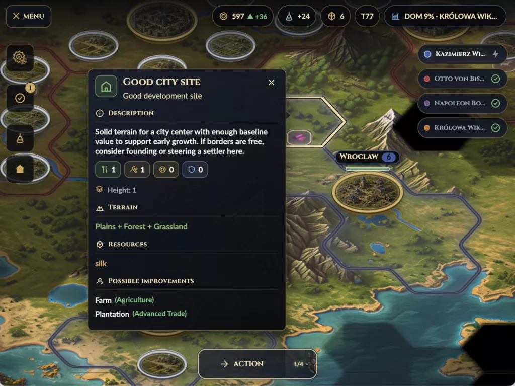
The HUD has to sit on top of the game world and remain readable without covering too much of the map. It must support compact controls, resource summaries, turn actions, selection details, objective hints, and warnings.
That is why there is a separate GameHudTheme.
It defines sizes like:
abstract final class GameHudTheme {
  static const double buttonHeightCompact = 48;
  static const double iconTileSizeCompact = 56.0;
  static const double actionButtonWidthCompact = 50;
  static const double endTurnButtonWidthNormal = 136;

  static const int toolbarSurfaceAlpha = 242;
  static const int actionBgAlpha = 185;
  static const int actionActiveBgAlpha = 225;
}
The HUD is not just “the same UI but smaller”. It has its own rhythm. Buttons need predictable dimensions. Resource counters need tabular figures. Selection panels need to avoid layout shifts. Important actions need to remain reachable.
A 4X HUD is closer to an instrument panel than a landing page.
Why I Avoid One-Off Styling
The biggest danger in Flutter UI is convenience.
It is very easy to write:
Container(
  decoration: BoxDecoration(
    color: const Color(0xFF101620),
    borderRadius: BorderRadius.circular(12),
  ),
)
That is fine once. It is dangerous fifty times.
Every one-off style creates another tiny design decision. Eventually, the UI becomes full of almost-the-same colors, almost-the-same borders, almost-the-same buttons, and almost-the-same panels.
For a game like Age of New Worlds, that hurts both development and presentation.
So I try to move repeated visual decisions into named concepts:
raw color        -> HudPalette / GameUiTheme
raw alpha        -> BorderEmphasis / SurfaceElevation
raw radius       -> SurfaceShape
raw button       -> EpicButton
raw modal        -> GameModalScaffold
raw screen title -> GameUiScreenHeader
This makes the code less visually arbitrary.
The Map Still Comes First
The UI has a strong visual identity, but it should not compete with the map.
That is a balancing act.
The gold/copper style gives the game a historical strategy tone, but the surfaces are dark and semi-transparent enough to sit over the board. The HUD can feel ornamental, but it cannot become decorative clutter. The player should always understand that the map is the primary object.
The UI is there to frame decisions:
- where to move,
- what to build,
- what to research,
- which city needs attention,
- why an action is unavailable,
- what changed this turn.
If the UI draws attention to itself without helping with those decisions, it is probably too loud.
Templates as Architecture
Templating is usually discussed as a productivity tool. In this project, I see it more as an architectural tool.
A reusable UI template creates a boundary. It says:
- this is how modals work,
- this is how screen headers work,
- this is how actions are displayed,
- this is how panels are framed,
- this is how semantic colors are applied.
That reduces decision fatigue. It also makes future changes safer.
If I want to change the modal width, I change GameModalScaffold.
If I want to adjust surface shadows, I change SurfaceElevation.
If I want a less saturated gold, I change HudPalette.
If I want buttons to feel more compact, I change EpicButton.
The alternative is visual archaeology: searching through dozens of screens to find every local decoration.
What I Learned
The main lesson is that Flutter gives me enough flexibility to build almost anything, which means I need discipline to avoid building everything differently.
For Age of New Worlds, the UI works best when it follows a small number of rules:
- the palette is centralized,
- styles are named by meaning,
- surfaces have semantic elevation,
- repeated layouts become templates,
- HUD components use stricter sizing,
- flavor supports readability instead of replacing it.
This is not the final visual identity of the game. It will keep evolving as the project grows.
But having this foundation means the UI can evolve deliberately. New screens do not start from a blank Container. They start from the visual language of the game.
That is the real value of a small UI system: it keeps the interface coherent while the game underneath becomes more complex.
Leave a Reply